
PRODUCT PAGE RE-DESIGN
E-commerce product page design showcase.
Goal: higher product-page conversion by clarifying benefits, simplifying choices, boosting trust, and streamlining mobile checkout.
Solo Project
My Role
Web Designer - Design and Research
Tools
Figma
Problem
It doesn't educate. The main worry with a beach tent is putting it up. On sand, in wind, often alone. The page says "setup is quick and easy" and points to a setup tutorial that isn't linked. Nothing shows how it actually works, or how the 10ft by 10ft size compares to the smaller tents.
It doesn't show credibility. 197 reviews, and only the number appears. No quotes, no photos, no sense of who bought it.
It doesn't build trust. Shipping, returns and warranty are one line of small grey text. The page contradicts itself twice. Delivery is 3 to 7 days in the buy box and 3 to 5 days lower down. Weight is 8.8 lbs in the bullets and 10.3 lbs in the details.
Solution
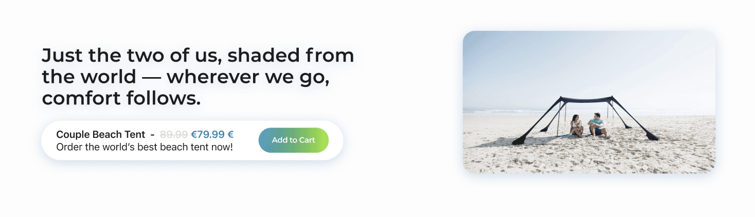
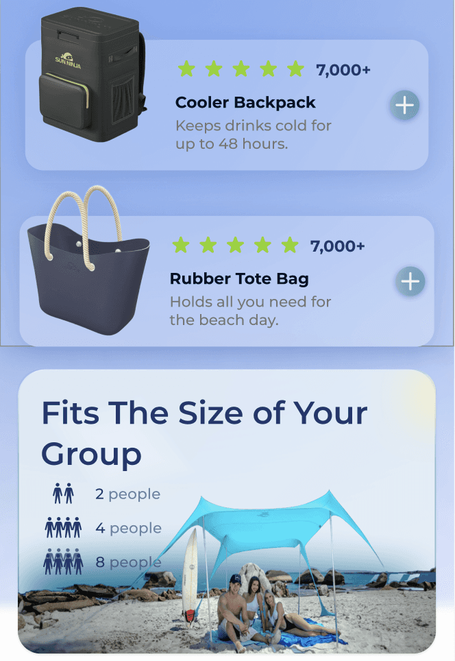
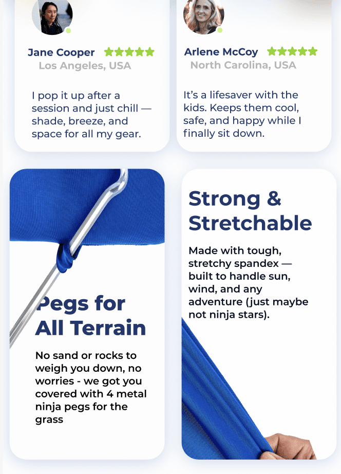
Educate. A three step setup section, lay, fill, set up, so the biggest objection is answered on the page. A group size card showing 2, 4 and 8 people, so size is a decision you can make here. Feature cards for what people actually ask about: UV protection, pegs for grass, stretch fabric, water resistance.
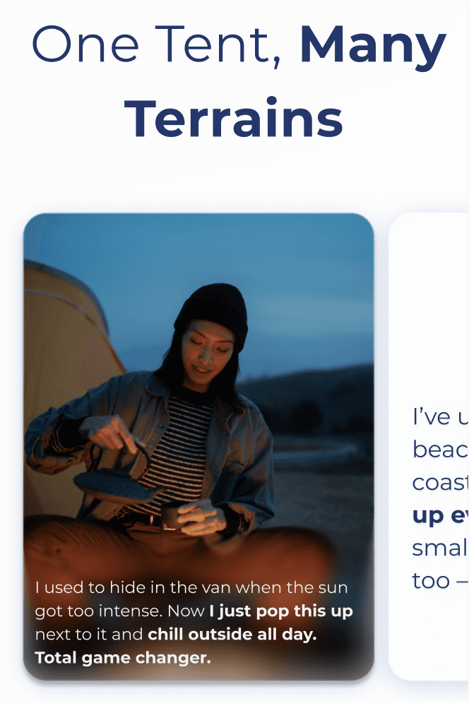
Show credibility. Reviews as real quotes with names, not a count. A press row for the outside coverage.
Build trust. Shipping, returns and warranty as three separate lines with icons in the buy box, next to stock status and payment methods, so the guarantees are part of the decision rather than fine print beneath it.
Resarch
Without access to analytics, support tickets, or customers, I based the redesign on clearly labelled secondary research.
Baymard Institute’s ecommerce studies show that product pages are a widespread weak point and that missing information often causes shoppers to abandon a purchase. Reviews are especially influential for high-consideration products: Northwestern’s Spiegel Research Center found that displaying five reviews can increase purchase likelihood by 270%, with verified reviews adding further credibility.
For beach tents, setup difficulty and wind stability emerged as the category’s biggest concerns. Yet the existing page hid 197 reviews and linked to broken setup information.
The redesign therefore focused on three priorities: making reviews visible, explaining setup directly on the page, and highlighting external credibility. With full access, I would validate these decisions through review analysis, support-ticket patterns, behavioural data, and usability testing.

After the showcase, you can dive into the design process.













Design Process


Problem Definition
Target Users
Pain Points & User Needs

Wireframes Design
High Fidelity Design


